Dolores marat


|
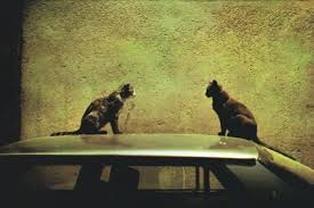
The colours in this image are quite dark and grungy colours.The cats are positioned so they're are directly opposite each other and are symmetrically sat on each side of the image. There are shadows towards the far left of the image and the bottom, which creates a mysterious feel. The wall behind the car has a granulated/sandy looking texture. The composition, like in most of her images, is very simple, as there is not a lot of things going on in the image. The choice of lighting gives a dull/dirty feel as well. There are no bright contrasting colours which gives off an eerie feel. The cats are the main focus of the image as they're like silhouettes positioned in the foreground.
|
Original Images


Our task was to take 12 images that fit into a theme of our choice. I decided to take pictures of colours but make them out of focus as well. I decided that I wanted the colours to be more vibrant so I edited them so that the colours were brighter and more contrasting. I like how my images turned out because they're very out of focus and have an almost smudged effect that makes the colours make a trail which creates more contrast. I like the bright colours because they're very eye-catching.
Edited Images


These are the edited versions of my original pictures. I prefer these pictures because the colours are very bright and vibrant. They are also very eye catching. Editing the pictures was simple and easy to do when using photoshop.
Laura Letinsky


Laura Letinsky images are related to edges as in all of her pictures she has the edge of a table with a white cloth. In some of her images she has edges of other objects on the table. The images have light pastel colours instead of harsh contrasting colours. In each image the table is positioned differently, e.g, some of the pictures have the entire table in frame with a bit of the edge in the upper section of the image. She tends to use mostly fruit and other objects as the subject matter of the images. In one of her images, she positioned the table with colourful objects on it towards the centre of the image, and had a completely white background. This made the pop of colour on the table contrast more and made them the first thing you see in the image. In another of her images she cropped out the objects in the image so that only half of the objects are visible, this changes the focus of the image, as the objects she cropped have the most colour. Her images are sort of faded/blurred which gives the image a softer vibe. The blurred effect makes the shadows and objects look less realistic and more painted. Not many of her images incorporate shadows, except for in the 5th image there is a light source/window that is creating shadows on the wall behind the table. None of her images are taken at the same angle, or use the same sort of colour scheme as the others.
Images inspired by dolores marat


Edited images


I plan on using these images in my final sculpture. These images were inspired by Dolores Marat. I think my images are similar to Dolores Marat because her images have a dark filter over top and they have a lot going on in the pictures. Also the colours in her images are dark and toned down in contrast. I like how some of these images are out of focus and smudgy looking. I also like the splash of orange in some of the pictures, as it is the only bright colour seen in all the images together. I aimed to have a dark grey theme for my images, however I unintentionally incorporated lots of metallic silver objects in too, which I think complements the darker greys and oranges, resulting in a happy accident.
fIRST OUTCOME


Evaluation
Before I started my final piece, I researched a variety of artists, Including Dolores Marat and Laura Letinsky. I decided to take inspiration from Dolores Marat because I liked the kind of dark filter she has over top, and I tried to mimic this in my pictures.
I think I succeeded because the images fit under the theme of 'edges'. I originally intended to take pictures that have a white and pastel colour theme, and then mount them on a large sheet, however, I found Dolores Marat's work and decided I liked her work better than Laura Letinsky's work because of the dark theme of her images. Due to the dark theme of my images, I decided to make a booklet with black card to complement the images. I prefer the booklet idea to my other idea because the booklet is small and easily transportable. For me, it was challenging to decide on one artist to take inspiration from, but I tackled this problem by looking at a small amount of photographers rather than lots of them.
Overall, I think my final piece was a success because in each of the images there is an edge of a person/object.
Jan groover


I've decided to use Jan Groover as my inspiration because I really like the way she uses shadows in her images, as the shadows are also edges as well as the objects in the image. I like how she uses objects from the kitchen and I want to implement that into my own photos. I think that the use of colour in the fourth image as the primary colours really contrast against the white back ground and silver cutlery. The bright colours and white background also creates a simplistic feel because of the basic primary colours. The first image has mostly blue shades and has some contrasting orange colours. The composition in the first image is very obviously laid out in a specific way, as the spoon has been positioned against the bowl in an abstract way. I really like the metallic tones and colours of the third image, especially because the metallic looking background sort of blends with some of the colours on the pear, which makes the green colours on the pear pop against it. The pears where positioned to be exactly symmetrical to each other, and the main focus of the image as they're in the centre. The fifth image has no colour or focus of the image, which gives it a cluttered feel, as there is nothing to focus on as there is no colour, so you don't know where to look. The sixth image has only the very end of a fork and has hardly any objects in the frame. The shadow in that image takes up a lot of the frame.
the barbican


I went to The Barbican in central London, in an attempt to get some interesting edges related images. I was happy to see all the interesting buildings. Some buildings were extremely geometric and other where more interesting, like the first image, which has lots of balconies sticking out of the sides to create an interesting rectangle that stretches until it touches the sky. It was a sunny day, meaning the lighting was very natural and dispersed, so the shadows were not very apparent. I really like the pictures of the building in the water, because I think it is a unique way of portraying edges.
Images inspired by jan groover


These images are inspired by Jan Groover's photographs. I took images of various items around my kitchen, including cutlery, fruit and other kitchen appliances. I really like how these images turned out generally. I accidentally put the ISO (F-Stop) on a low
setting, meaning the images came out quite dark, however I think this was a happy accident as Jan Groover's images are generally quite dark. I also like the darkness of the images as it causes the images generally to look quite dull and almost vintage. I also think it also complements the general lack of colour in all the images and the cool grey of most of my appliances and cutlery, as they don't stand out too much. The coolness of the images makes the small amount of colour pop slightly but not in an intense way. The colours don't immediately attract your attention however they complement everything else as they not too bright or outstanding. There is very little shadows in these images, which I would change next time to add some more contrast, which I think would look nice against the cool tones.
setting, meaning the images came out quite dark, however I think this was a happy accident as Jan Groover's images are generally quite dark. I also like the darkness of the images as it causes the images generally to look quite dull and almost vintage. I also think it also complements the general lack of colour in all the images and the cool grey of most of my appliances and cutlery, as they don't stand out too much. The coolness of the images makes the small amount of colour pop slightly but not in an intense way. The colours don't immediately attract your attention however they complement everything else as they not too bright or outstanding. There is very little shadows in these images, which I would change next time to add some more contrast, which I think would look nice against the cool tones.
