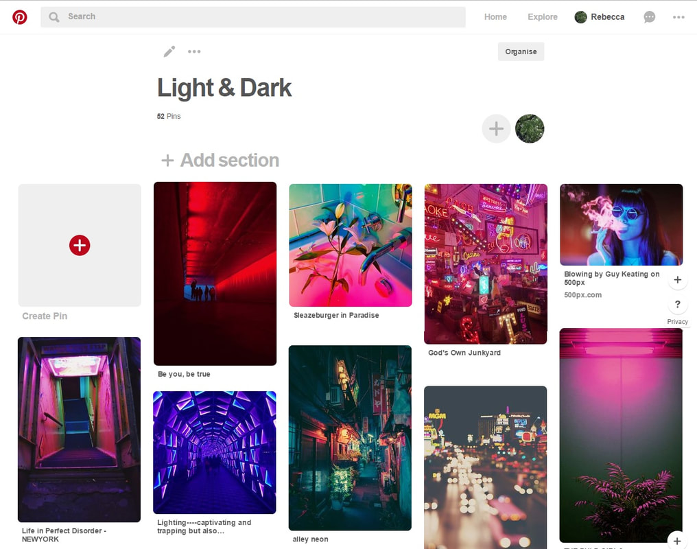
pinterest board
aLEXEY BEDNIJ


Alexey Bednij is a Russian photographer who shoots black-and-white images of people and animals, then digitally places them against their own shadows. The main element of his images is the contrast between the dark and light areas in the frame, and all the shadows. The shadows in his images are often solid negative space, so they are most likely created with artificial light sources. His images are abstract in the sense that the shadows he creates are not ones you would see in real life. and the composition of the shadows and the people are very different as well. I really like the images with the matches as they must have taken a long time to get each match to a specific level of burnt to match up with the negative space in the background. This is effective as it is almost satisfying to look at. and similar to the pictures of the chess pieces which are very appealing to the eye as the shadows have very sharp cut edges, and almost don't look like shadows. The shadows in his images are positioned so that they are the first thing your eye is drawn to, and are the most contrasting areas of the image.
john batho


John Batho, a French photographer, began practicing his art in 1961 at a time when the black and white aesthetic was prominent. He places people behind a foggy transparent screen, where you can see the silhouettes of the people behind it. He changes the background to black in some of his images, so that there is a different type of contrast between the people and the background. His images are simplistic in the sense that there is not a lot of objects in his images, however they are also very abstract as they are not something that would be seen in everyday life. The texture on the clear screen looks almost grainy and blurry, so the people standing behind are almost indistinguishable as people. These images have no form of colour in them, meaning there is a range of different tones. There is lots of negative space in his images around and inside the people. The subjects heads and legs fade into a gradient of grey tones. He uses artificial lighting to create harsh lines and silhouettes.
willy ronis


Willy Ronis was a French photographer. His best-known work shows life in post-war Paris and Provence. He uses a black and white filter overtop of his images to create contrast between the shadows in his images. The subjects in some of his images are positioned so that they are the main focus in the frame, for example, in the second image the women and the table are positioned in the centre of the frame, so they are the first thing your eye is drawn to. The buildings in his images are often old looking, representing the age period he took his images (1950's). His images capture how people in France live their everyday lives. The third image is a good example of how he uses the black and white filter to emphasise shadows, as in the background you can see the shape of the buildings against the landscape and the silhouettes of the people walking across the bridge. He tends to use natural lighting as his images are street photography based, so they are very candid looking.
horst p horst


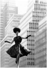


Horst P Horst was a German-American fashion photographer. Horst is best known for his photographs of women and fashion from the late 1930's. One of his most iconic photos is "The Mainbocher Corset" (bottom right image). All of his images are in black and white, which emphasises certain details and textures on the subjects of his images, for example, the third image has most of the lighting focused on the womans shoulder and face and you can see the texture of the clothes she wearing, which has been emphasised by the choice of artificial lighting. This also directs the attention to specific areas of his models and subjects. He uses woman throughout majority of his images, with each of these women wearing clothing deemed classy or provocative for this period of time. He uses sometimes uses darker backgrounds behind the models to make the model stand out or lighter backgrounds in pictures where the model is wearing darker clothes, so either way the models stand out.
Edward Weston


Edward Weston was a 20th-century American photographer. He has been called "one of the most innovative and influential American photographers". Over the course of his 40-year career, Weston photographed a variety of subjects, including landscapes, still lifes, nude images, portraits, etc. Some of his most famous photographs were taken of the trees and rocks in California, near where he lived for many years. His images get up close to natural forms such as shells and plants. The photos each have a black and white filter over them to emphasise the details on each of the objects in the images. The shadows in his images are very defined and and hard, due to artificial lighting. The detail on images, such as the third one, are very precise and and defined, as some areas are highlighted and others are very dark, due to the choice of lighting. The background for each photo is black, so it tends to blend with the shadows in each of the objects, making specific areas of the objects the main focus for each of the images.
marilyn mugot


Marilyn Mugot is a French graphic designer and photographer. She invents and imagines her own scenarios and landscapes and constructs an entirely different reality by editing the colours in her images. Mugot is inspired by retro, futuristic 90's movies with which she grew up. Her images are very futuristic in their colours and the types of buildings she photographs. The building in the second image looks almost like a hologram due to its white lighting, which adds to her images being futuristic. Although she photographs buildings that look dirty and low budget, the pink lighting makes the images more visually appealing. All of her images have a general theme of having pink neon lighting. Marilyn Mugots images are my favourite images because of how visually appealing and well composed all her images are. I really like how busy her images are, and how the pink lighting ties all the images together. The lighting also makes the images look like they are glowing in a way, and your eye is instantly drawn to the details in them. I want to incorporate her use of neon colours in my work.
Janne Parviainen


Janne Parviainen, 34, from Helsinki, Finland, takes up to 20 hours to create each light painting. He draws out lines with chalk and traces over them with LED lights. I really like the harsh contrast between the dark and the bright neon lights, because it makes his images very visually appealing in the sense that they are very eye-catching. His images are very complicated and abstract because they are representative of real people and objects, but are not portrayed exactly how they would be in real life. I like how each images tends to have one colour scheme, for example, the third image only incorporates shades of green and the 6th and 7th images both incorporate various shades of red. However my favourite image is the second image because it is very detailed and complicated but the colours complement each other and give a 3D effect. I also like that he takes what is a normal situation, for example, the 8th image which is just people at the cinema, and makes them look not so normal by painting over the people with light. I might experiment with using light painting for a final idea, as I am inspired by Janne Parviainen's use of bright colours.
josef sudek


Josef Sudek was a Czech photographer, best known for his photographs of areas in Prague and still life objects. His images are very beautifully composed with the object as the main focus in the centre, and almost nothing behind them. The colours in some are soft, smokey grey tones and in others harsh, sharp light and dark grey tones that contrast largely with each other. His photos are very elegant in their composition, colours and their choice of objects such as trees, flowers and glasses with delicate curves contribute to the elegant feel of the image. The lighting in the ninth image is very unique and interesting because the lines are very straight and geometric and the shadows take up the wall behind the objects. The lighting he choses is very natural due to how dispersed and soft the shadows and colours are. I really like how In his images of the glasses of water, the bubbles look very defined as they are rising up the glass. I would like to take images of a glass of water in a similar way.
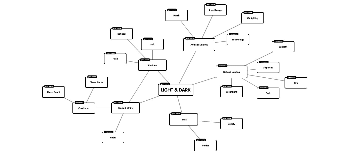
sPIDER DIAGRAMs


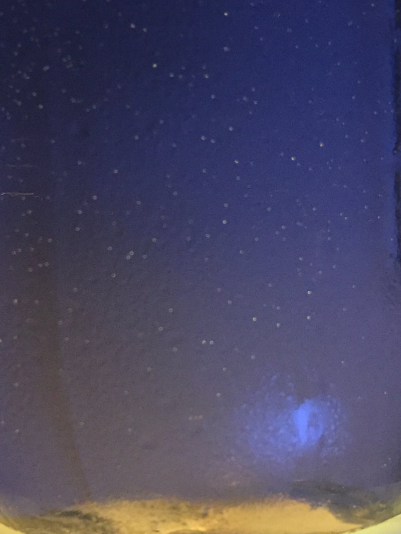


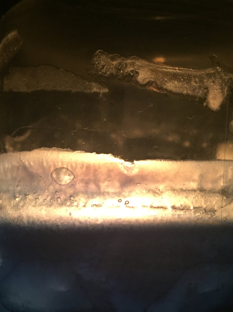


When taking these images, I wanted to implement neon colours to contrast with a dark background. I took pictures of a clear cup filled with water that had a white light underneath it. I like how those images turned out as you can see all the bubbles in the cup which are emphasised by the light underneath. I also like that from some angles the light looks more blue toned and from other angles more white toned. The light coming out the cup is a soft glow of white light which disperses across the wall behind the cup and blends into the darker parts of the images making the images more contrasting. I used artificial lighting to make the lighting soft. In some areas the light is more concentrated than others. When taking pictures of the candle, I wanted to get close ups of the melted wax on the side of the candle. I like how the texture of the wax is emphasised because of the fire behind it. I also like how some parts of the wax are blue and other parts are more transparent. The light from the fire is a warm toned yellow which contrasts against the cool toned dark blue. I like the images where the candle light is very concentrated in the centre of the image, and blends into the darker wax because it emphasises the textures of the wax, making it look bumpy and almost like bubbles. I want to retake the images of the candle so that the focus is better and the textures of the wax is more emphasised.
Best images


These are images I think worked the best. I think this because in each of the images, there is a contrast between the dark and light colours. I was inspired by Josef Sudek's own images of a glass of water with bubbles. I like these images because the lighting is very soft in all of them, and varies in tones from white to blue. I want to take images similar to these using different coloured artificial lighting. I was inspired by Marilyn Mugots use of neon pink street lights, and want to implement that idea of bright artificial colours in my photographs. I also want to find a way to make the bubbles in the cup more emphasised. I might do this by changing the position of the light source, or getting closer to the bubbles with my camera, although I don't want the frame to be filled with the cup, as I like the blend that occurs between the light and the dark when i photograph the wall aswell as the cup. I like how these images are simplistic in the sense that the is only one colour in the images and only one object. The first image is my favourite image because the light is very soft and dispersed, and the light coming from the lid of the cup is more concentrated than the rest of the image, making the cup look as if its glowing.


When retaking these images, I wanted to change the harshness and colour of the artificial lighting I used. I also wanted to look at how defined the shadows would turn out. I really like how these pictures turned out, as the shadows in some areas are very dark and have defined edges and in others they shadows are dispersed and blend into the colour over the image. I also really like how in the images with the glass full of water, the light radiates from the glass and disperses towards the edge of the image, give the glass a kind of glowing effect, which I think goes really well with the bright artificial coloured lights underneath. The edge of the glass is darker to show the outline of the glass, making it look almost like a bubble. When I moved the light closer to the book, the shadows got more defined and harsh, which I didn't like because there was little variation. I'm happy with how these turned out, and I would like to incorporate neon lights into my final piece.
light painting experiment 1


We decided to consider light painting as an alternative for a final piece. From previous experimentation with light painting, we knew that the best camera settings were: ISO 100, F-STOP 8 and 13 Seconds. However, after experimenting we decided that 10 seconds was a more appropriate amount of time, as 13 seconds was much longer than we needed. We chose to experiment by getting up and image of a block colour on our phones and using that as a replacement for pen lights. I didn't like this idea, although it has an interesting smudgy effect, I prefer the thin, precise line from the pen light. These images were created more so that we could get an idea of what camera settings were best and what looked best with the background of the dark room.
light painting experiment 2


After experimenting with light painting, we decided to try again, now that we knew how to set up the camera properly and what settings worked best. This time though we wanted to respond specifically to Jeanne Parviainen by using red and white pen lights to outline and draw over objects and people. We used the same camera settings, except we forgot to get a manual flash block causing the images to have a darker red tone. Although this was unplanned, I really like the vibrant red as it contrasts with the colours from the pen lights, so it ended up being a happy accident. My favourite images are the ones of us lying on the floor with lines drawn on top because I think they look very abstract and are the closest to looking like Parviainen's work.
original images
I decided to respond further to Josef Sudek because I was really inspired by his still life images. On a day when it was sunny, I took pictures of various objects that I found around the class room, including a tin, a water bottle, a jar of colourful liquid, and a large glass bottle filled with water and wax. The sunny weather created defined and interesting shadows around the objects and on the walls. I'm particularly happy with the images of the bottle of water and wax, as in the natural lighting, the wax looked especially soft and elegant in the sense that there was very little contrast or shadows separating the wax, leaving it looking very soft and malleable.
black and white


I decided to edit these images of still life objects, to show definition and to show them to be a response to Josef Sudek. In Photoshop, I put a black and white filter over each image, and then turned the contrast up slightly. Doing this was really subtle but effective in the sense that it made all shadows and edges more defined. I prefer how the images of the water bottle full of wax looks without a black and white filter, as I think they suit being soft and elegant more than hard and defined, although I do think the wax looks really interesting and abstract with harder edges. I think the images of the shadows look much nicer in black and white as there is a higher contrast.
photograms


Another Option for a final piece is photograms, which at first I wasn't very excited to try because I didn't find photograms that interesting generally. However, I found some interesting objects in the dark room, including, a cafe menu printed on acetate, a crushed up clear water bottle and some photo negatives. I really like how my photograms turned out as I think they're interestingly composed and unique because of the objects. One thing I don't usually like about photograms is when the objects are randomly situated about the paper, however I realised that photograms actually look less interesting when the objects are organised and set out neatly. After experimenting, I have developed an interest in photograms and various photogram based artist who carefully lay out photograms that have a point and aren't random and unorganised.
looking at shadows


I took these images with the intention to only focus on small sections of shadows. I don't think these pictures are very interesting , however shadows are an important part of Light And Dark and also photography in general so I tried to carefully select which shadows I took pictures of. I think I found some really interesting shadows, like the ones on the floor outside where reflecting the window. The shadows were so interesting in that area, as at first I couldn't even tell where they were coming from. I wasn't sure how to make shadows interesting, so I tried to keep the images basic and simple, because that's exactly what shadows are.
