Introduction
The natural world in photography means to take pictures of things from nature such as, trees and plants, and take them in a way that makes the objects look interesting. I chose to take pictures under the theme of the natural world because I saw one artist (Sarah Illenberger) who's images I really liked because of how she interpreted the natural world and how simplistic yet interesting and eye-catching her images are. I also like how she focuses specifically on colour.
|
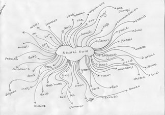
Our task was to create a mind map/spider diagram on words related to our chosen theme. I chose the theme natural world, and came up with lots of words related to that. A tip for getting as may words as possible is to write down words as they come to your head, and don't stop to think about what to write next as this slows you down, resulting in less words. We created these as a source of ideas as to what pictures we wanted to take for our final pieces that related to our chosen themes.
|
Sarah Illeberger


Sarah Illenberger is an artist, illustrator and designer. Her work consists of giving common things a new meaning. She creates art using various materials and techniques, which are then photographed or presented in public places. I really like her work because she finds a way to incorporate some abstraction into her work, for example, by the solid block colours behind the subjects of the image and the fact that you wouldn't see these things in real life as they are presented in the images. I like how simple her images are because they're very eye-catching and nice to look at. The use of block colours creates contrast with the other objects in the image.
|
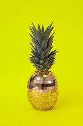
Like all of Sarah Illenberger's work, this image takes a natural object, in this case a pineapple, and combines it with something man made. This unites the natural world and the man made world, and creates an interesting image. The background is a solid eye-catching colour that doesn't contrast as much with the object. Her images usually have very limited shadows, meaning there are no harsh lighting nearby. Her images are very simple, with usually only one object in the image. The disco ball that is replacing the rest of the pineapple, is the first thing your eye is drawn to because it is not something you would usually see. Her images can also fit under the theme of abstraction because they're not something you see in real life. I really like her images because they're very basic yet very interesting and eye-catching at the same time.
|
Olafur ELIASSON


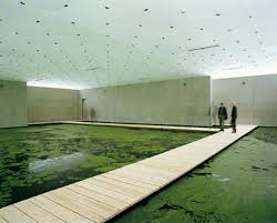


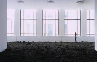
Olafur Elisson is a sculptor, painter and photographer. Eliasson strives to make the concerns of art relevant to society at large. He takes natural objects and landscapes, and incorporates them into something man made. The third image is a very interesting image, as he and a team of people filled the floor of a room with dirt. This is very effective as it really emphasises the simplicity of the natural world, yet shows how complicated the man made world is through the windows showing the buildings on the outside. His images usually have dark colours with a single source of light coming from one area. The eighth image is my favourite image because of the lighting. I like how dispersed the lighting is, and how the lighting melts into the the objects of the image. The children standing in front of the railing contrast with the rest of the image.
|
I think this image shows the difference between the natural world and the man made world. I think this because the dirt in the room, is very plain and simple, whereas the windows show the outside, which is full of complex buildings. The walls of the room are very simple and geometric. The colours in the image contrast with each other although there are not bright colours like in most of his images. The lighting is very dispersed, yet it does not reach the whole of the image as the bottom section of the dirt is much darker compared to the rest of the dirt. The windows seem to be the only source of natural light.
|
Jason DeMarte


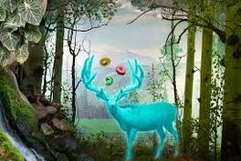
Jason DeMarte is a digital photographer. Jason DeMarte explores the use of natural themes. He carefully arranges objects once found in nature, such as flowers and birds, mixes them with bright, artificially colored food products and graffiti and photographs them separately so that the objects can be composed and edited into a single digital image. The final result is noticeably unnatural, yet somehow familiar, within its arrangements. DeMarte's work is another example of a photographer combining the natural world and the man made world. His images are very unique in terms of the way objects are edited and composed, for example, the last image is an edited image of a bunch of crisp collected in a group on a grassy plain field. This is very abstract in the sense that its not something you would see in real life. Its also familiar because it is representative of animals collecting together as a group, but in the form of something man made.
|
This is a very unique image due to the objects in the image. The deer in the centre is the first thing your eye is drawn to, because of its colours that almost make the deer glow. Surrounding the deer is lots of plants, vines and greenery, that create a sort of opening in the shape of a circle, which also contributes to the deer being the thing your eye is drawn to first. Above the deer are three bright and artificially coloured donuts, that represent the man made element that appears in his images. His images look very artificial as they're all edited so that they look almost plastic and not real. The colour scheme of his images usually consist of natural green colours with bright pops of contrasting colours. The lighting in this image seems to be radiating off the deer, with some natural sunlight dispersed in the field behind it, however the lighting doesn't reach the edges of the image, so they're left dark and appear to be untouched.
|
Aaron Siskind


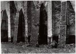


Aaron Siskind was an abstract photographer who would get up close and personal with different objects involved in nature. In a lot of his images, you can see the texture of the objects, for example, in the fourth image you can see the grainy and gritty texture of the brick because of how close up he gets to the objects. The use of the black and white filter he applies over his images emphasises the shadows created by the objects and changes how the image looks entirely, for example, the images become engulfed by the black shadows and makes the visible objects much more defined and prominent. The filter he uses is a very big part of his images as it creates more visible textures and shadows.
|
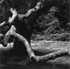
This image is a good example of the black and white filter changing the image. The branches coming from the trees look very defined and almost cartoon like. The filter also emphasises the the shadows in the image, leaving lots of black negative space behind the main objects of the image. The shadows give the image a 3D effect, as some objects in the image are emphasised more than others. The branches have a rough and bumpy texture which is emphasised by the filter. The textures of all the objects are The lighting is very dispersed, meaning that the lighting is natural most likely from the sun, and spreads across most of the image, with some areas covered in shadows because of the large tree that the branch is connected to. In the background there is a bush which has similar looking textures to that of the tree branch.
|
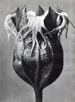
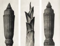
Karl Blossfeildt


|
|
Karl Blossfeildt takes images based around the natural world. His images capture the textures of things that he shapes to represent other natural objects. For example, he created a flower out of clay and shaped and modelled the clay to have a stoney and almost spiky texture. The lighting he uses is often centred in one area of the object and disperses softly so that there are lots of shadows on the objects. The edges of the leafs are sharper and more dangerous looking because of how defined the lighting and shadows make them. The shadows also make the texture more defined and 3D-looking especially in the image with the flower. The objects on the right have an almost ancient feel to them because of the brownish filter and the material he used to make the objects. Also the use of shadows contributes to the objects looking old. The objects seem dirty because of the filter and shadows which also makes them look old and used.
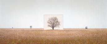
Myoung Ho Lee


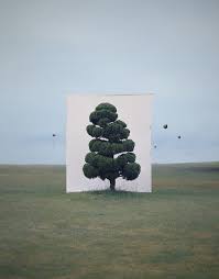


Myoung Ho Lee has been photographing the trees of his native Korea since 2006, isolating them from their surroundings by adding a white canvas behind. Each canvas has an almost plain landscape behind it to emphasise a feeling of isolation. I like how simple each of his images are as it emphasises the simplicity of nature itself. The colours of the trees he positions in front of the white canvas's usually match the colours in the landscape around them.
|
Olivia parker


Olivia Parker, a mostly self-taught in photographer, usually constructs what she photographs in the studio. Her photographs are fundamentally still life inspired by those painted in the traditional Dutch, Flemish and Spanish 17th century style. Her images are all dramatic looking because of the dim lighting in some pictures and the harsh lighting on the images with the shells. This makes the shells the main subject of the images, as they are almost emitting light and are strategically placed in the centre of the images. The black and white filter over top of the images emphasises the details of the images especially the images of the shells as it shows the textures on the shells and defines the lines and the ridges. The last image is also very dramatic looking because of the lighting as it is dim, but it is still focused on the centre of the image. However it disperses leaving the edges of the image darker, making your eyes focus on whats happening in the middle.
|
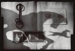
I really like this image as it is somewhat simplistic, yet interesting to look at. The shadow of the horses are very defined and create negative space. The horses are strategically placed so that the second horse appears to be running in the distance. The second horse is also placed so that it does not overlap the other horse and is a small distance away from the first one. The shadows are positioned so that they are the first thing you see. The background has very minimal details, and consists of a plain white background with pictures and what looks like rope on top of it. This simplistic background emphasises the horses' shape.
|


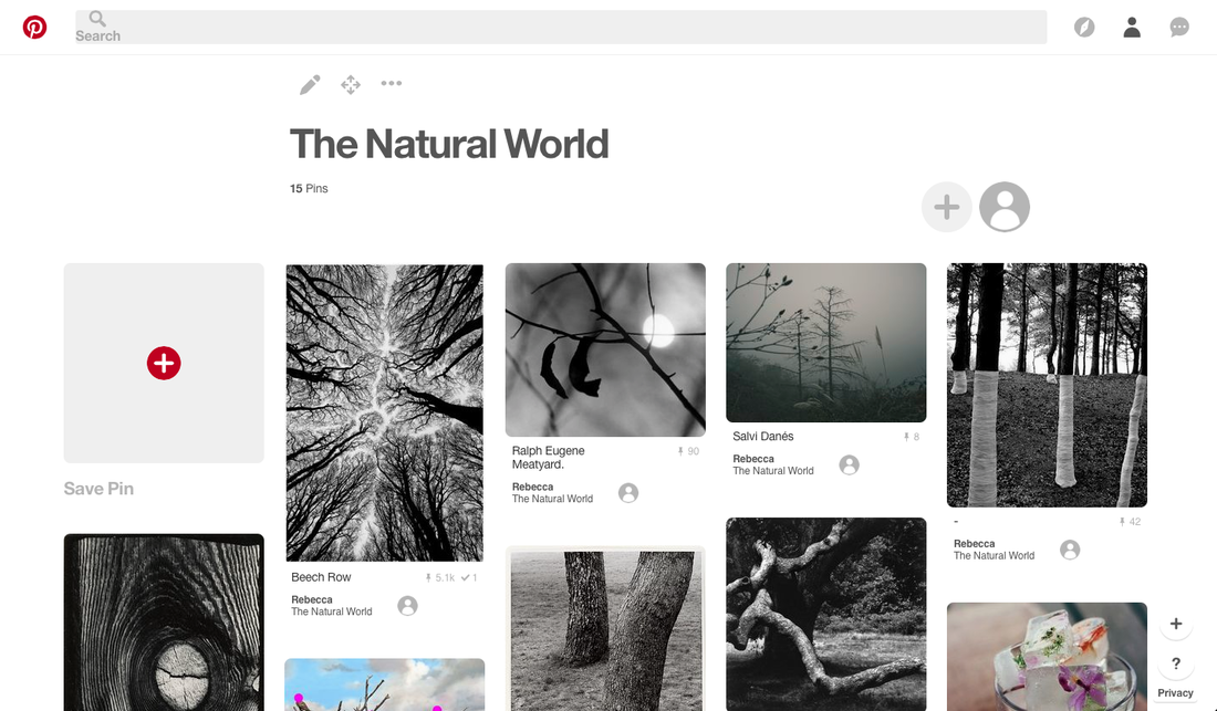
Our task was to take 15-30 images related to our chosen theme, mine being natural world. I think I succeeded because each of my images are related to natural world in some way. In some images, I wanted to incorporate some man made objects to show how they contrast. An example of this is the third image as there are boats on the water and lots of buildings around the water, etc. The eleventh image, I wanted to incorporate more man made objects, which is why there are cars and houses behind the glass covered in water and steam. I really thought about what things are to do with natural world and decided to incorporate my animals.
|
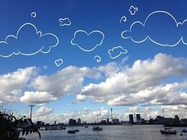
For this image I incorporated the natural world and the man made world with digital drawings. above the clouds in the image, there was lots of plain blue space, so I wanted to cover it with something so theres less negative space. I really like how the clouds in this image get smaller as they move further into the distance, and how they almost look like they're staying on the same level in the sky. Lots of elements of this image are natural, for example, the water, the clouds, the sky, etc. Theres lots of man made elements as well, that are mostly concentrated towards the lower half of the image, whereas the natural elements cover the entire image.
|
Final piece experimentation


As an experiment, I wanted to incorporate a smiley face on natural things, for example, plants and rocks. I wanted to do this so the images aren't as boring. I experimented with doing this with the nature around school to see how it could look, and to see what I could do differently. I took 34 pictures in total and these are the best results. The other images the lighting was either off or the colours in the image were too muddy looking. If I decide to use this idea as a final piece, I want to make sure I take them in areas that have lots of different colours, as I don't like the way the green is overly prominent, and the way the brown of the dirt looks with the green grass. I would also like to incorporate more shadows and different lighting, so for example more harsh lighting. I like the bright pops of colour like, for example, in the fourth image, so I aim to use that element in my actual final piece. I also plan to add some sort of digital drawings on top of my final images, to contrast and make the images more interesting and eye-catching.
Further experimentation
I plan to take lots of images of things from the natural world, and then edit them so that all the colours are bright and stand out. I also want to use these images to experiment with photoshop.


(original photos)
Photoshop experimentation


I wanted to make images of nature more brightly coloured, so that the colours really stand out. I like how the leafs are already brightly coloured because it's the beginning of autumn and all the leafs are changing colour, so editing the images made the red leafs stand out much more. I also like how the green is really bright and contrasts with the different colours of the leafs and flowers. I would like to experiment further with these images by using other photoshop techniques to change the colours in the images.


inverted images


When experimenting, I decided I wanted to try experimenting with photoshop. I didn't really know how to use photoshop but I just started experimenting and these are how they turned out. I inverted the images so that the colours changed and became more neon coloured. I really like how the colours contrast against the nature in the images, making the images more abstract. I like how there is an overall colour scheme (purple and black). The purple is really bright and eye-catching so it dominates almost all of the images. I also like how the shadows in the images are emphasised by the colour change, and the details in the images are more defined, especially in the last two pictures. I really like how the smoke from the fire in the last image looks as if it is painted.
INverted black and white images


I created these images in photoshop by adding a black and white filter over and then inverting the colours. I like how these turned out because the black and white filter emphasises the contrast between the different objects in the images, for example, the droplets of water on the leafs are more defined and are emphasised because of the colours being inverted.


I took images of a dying/decaying bunch of flowers. I decided I wanted to get close ups of the flowers, to emphasise the textures of the flowers and leaves. The images all focus on one area of the bunch of flowers which makes the area and the objects around the flowers out of focus. This makes the image more dramatic in the sense that the edges and the textures of the flowers are emphasised and are very prominent. I really like the colours in the images as they all complement each other, for example, the purple flowers and the green stems stand out against the white flowers but they are softer colours that are not too eye-catching. I also like how the decayed petals are slightly discoloured so that the lines and textures on the petals are more apparent. I really like how cool toned the images are, except for two of the images which are more warm toned because of the angle that I took the images from.
|
|
I decided to edit the pictures in photoshop, because they came out too warm toned, which didn't fit with the rest of the images. I like how these images look more after I edited them, although they are not exactly the same hue as the other images.
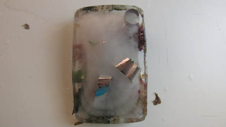
I plan to freeze these decaying flowers in a container and take pictures of the ice block as it is melting under artificial lighting.
|
|


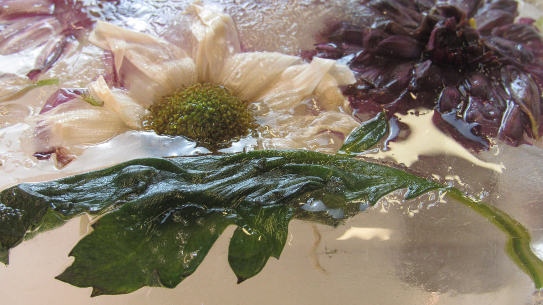


I decided to add some silver foil and differently shaped sequins into the ice block as well as the decaying flowers, which I later regretted as the sequins looked out of place with the flowers. I prefer the images that I took whilst the ice block was still fully frozen, as the flowers look hard and frozen. I really like that you can see the textures of the ice on the petals of the flowers because it gives the images a more still and unmoving feel. I also like the frozen images because they all have a general colour scheme, that being pinks and purples, with small amounts of green. I like how all the colours are light and soft, which gives the images a pretty and elegant feel. I chose to use artificial lighting on both sides of the ice block to help the ice melt faster, and make it so there are no prominent shadows.
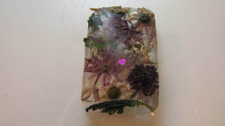
BEST outcomes


I chose 12 images that I think are the best images out of all of the ones that I took. I think these images worked because they all have a similar colour scheme, that being dark prominent purples, light pinks and different shades of green. Halfway through taking images, I decided that I wanted to add another light source around the other side of the ice block, so that the ice would melt faster and more evenly. I like these images as they were before I added the other light source so the ice is more frozen and looks very pretty. I also really like the angle I took them from, which was a low angle, so you can see half of the inside of the ice as well as the flowers and plants sticking out on top. I really like how the ice in some of the pictures looks glittery, which makes the snow look pretty and elegant.
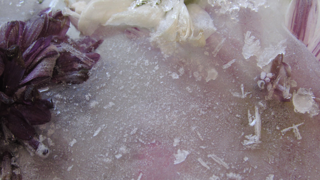
IMAGES TO IMPROVE


I picked 10 images that I thought turned out the worst. I dislike how these images look as in some the leafs are a dark shade of green because of the water, which also makes the leafs appear sludgy and wet. Also in some of the images I got some of the wall in the background, making the images look unprofessional. When the layer of frost melted off of the ice, the block became transparent, so you could see all the flowers inside, however the flowers that were on top of the block became drenched in water so they didn't look very appealing. The light was also reflected on top of the water, so it covered the flowers inside the block. I prefer the pictures that I took whilst the block was still coated in frost. Also in all of these pictures, you can see the sequins that I added, which I regret doing as they look really unnatural. I also wanted to get some pictures of the water melting around the block, but the lighting was positioned in a way that made the water look uninteresting, and when I would take a picture it would look like theres nothing there anyway. I also don't like how the plants sit on top of the water because it makes them look sludgy.
Final outcomE


|
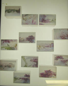
I decided to print my images on acetate paper and display my final outcome in small, transparent boxes to almost simulate ice. I photographed them on top of a light box and in front of an artificial light source. so the images in the boxes look really clear. When deciding how to display my final piece, I printed the images on regular paper as well as acetate paper, and decided to use the acetate paper because it made the colours in the images softer and more transparent and overall look more like ice when inside the box compared to the regular paper. When mounting each image inside the box, I had to be careful with how I put each image in as the ink was easily moved and could be easily scratched off. I also had to make sure to spend a few minutes, after using the spray glue, to press down each image into the box otherwise the glue would sit on the surface of the box and made the inside of the boxes look cloudy which covered each image.
|
